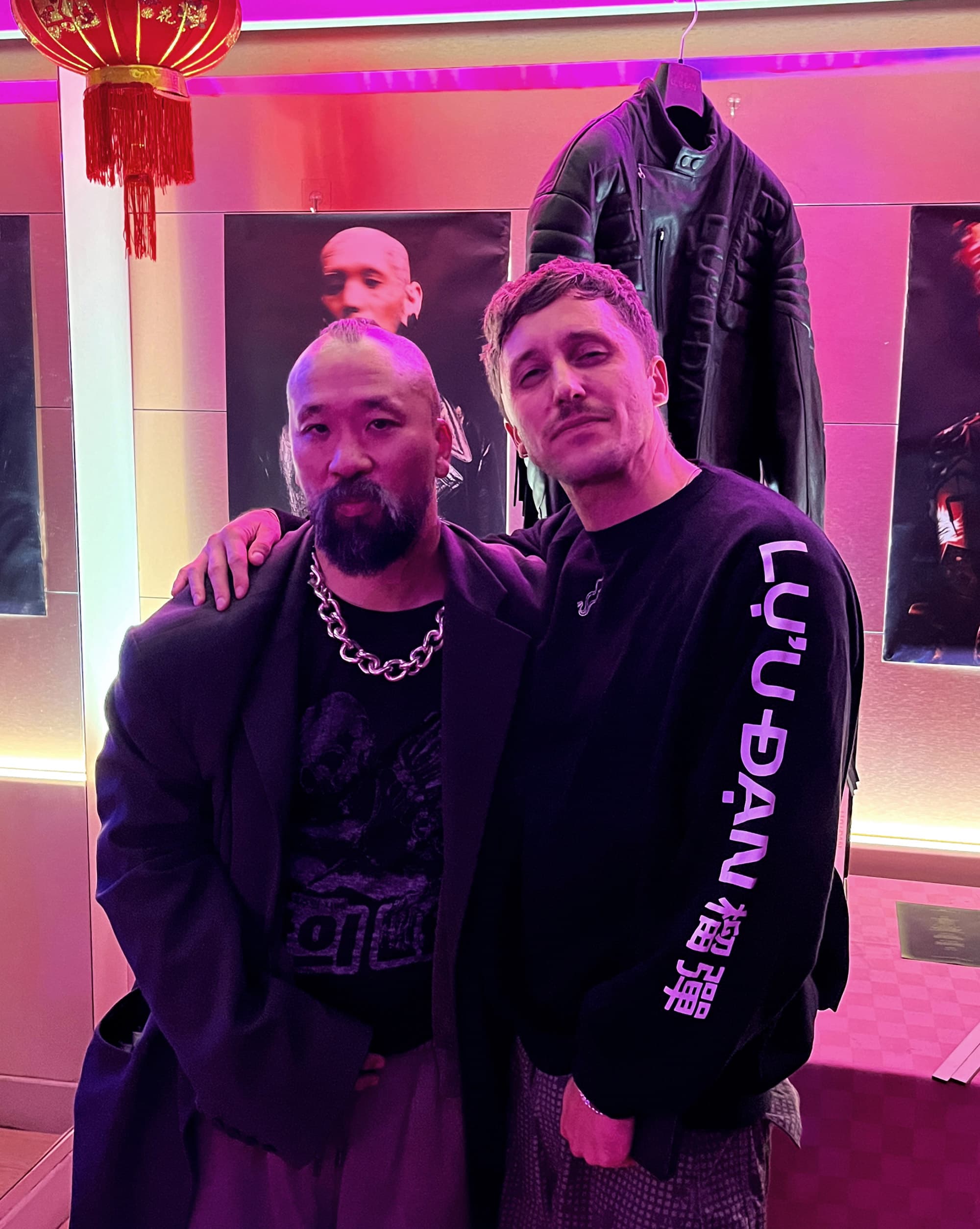
“The way we look at the LỰU ĐẠN man, he’s a bad boy but he’s got a big heart. There’s an emotional intelligence to him. It’s not just surface, it’s not the kung fu gangster you know; there’s depth to this man, and there’s spirituality to him as well.”
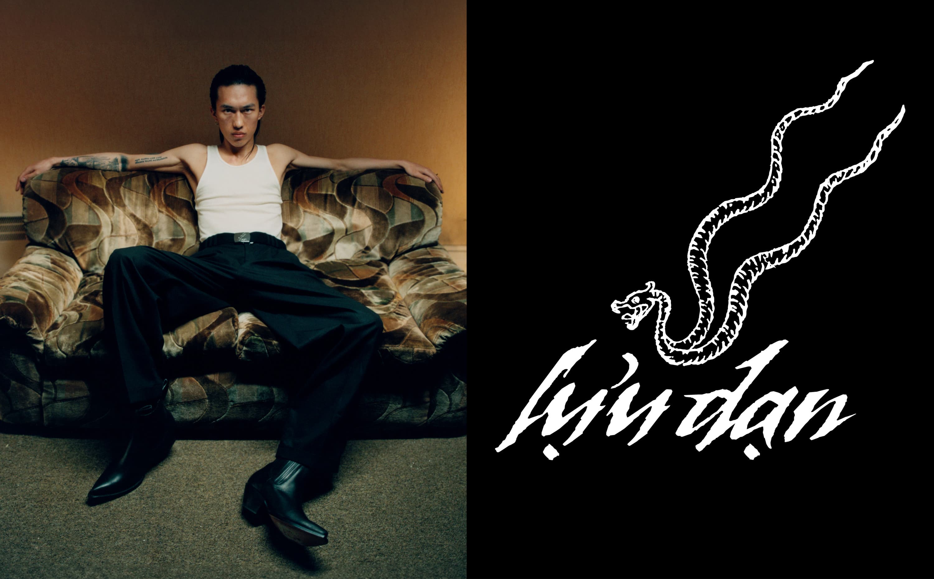
Hung came to me with a brand that existed as a story before it existed as clothes: the shared experience of Asian men, told without one-dimensional tropes, defiant and provocative. My task was to translate that narrative into a visual language strong enough to launch a new label on the global stage, from the wordmark on a swing tag to the storefront on screen.
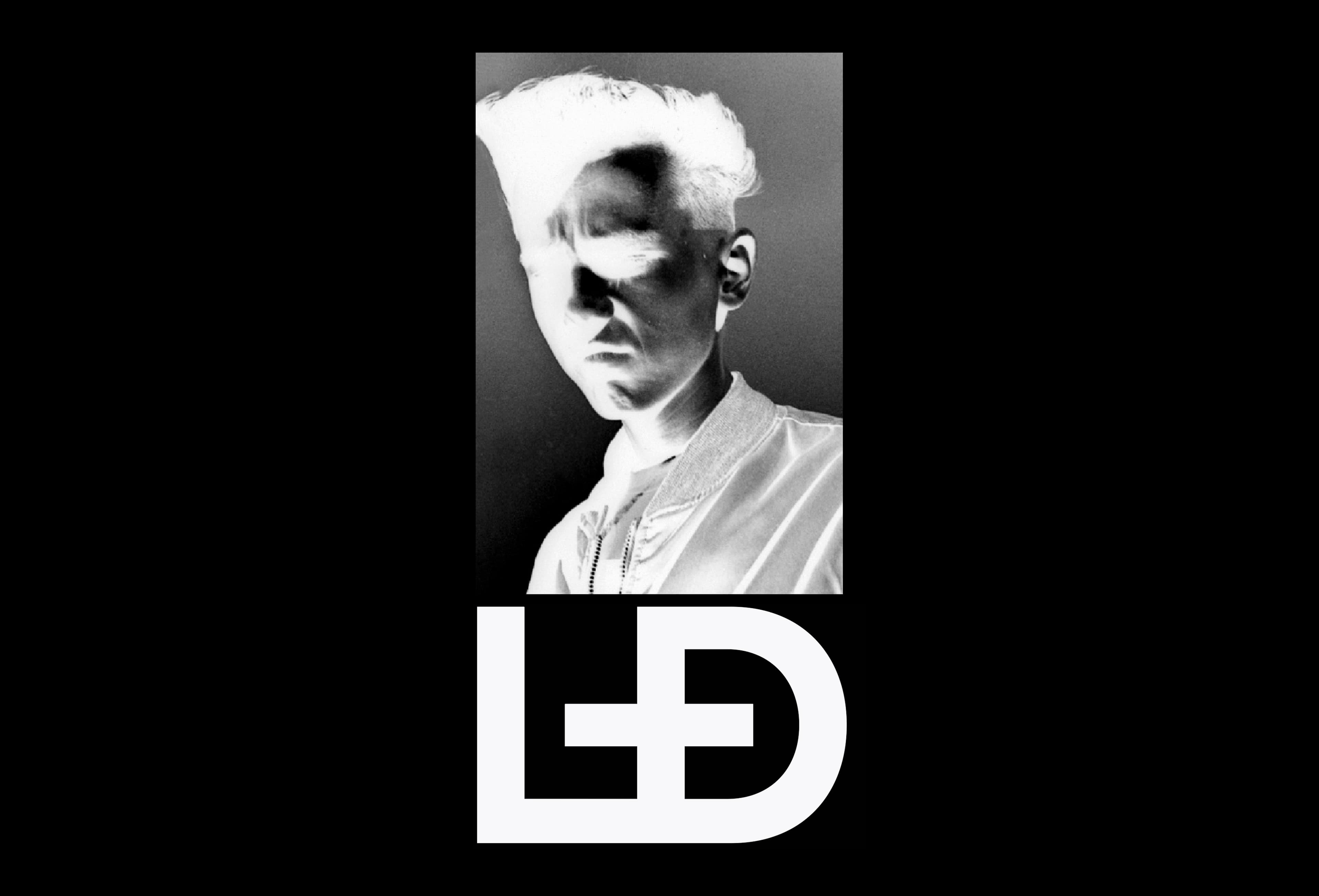
The identity had to hold two energies at once: the hard-shelled exterior of the LỰU ĐẠN man and the emotional depth underneath. I designed the wordmark and logo system to carry the Vietnamese diacritics with pride rather than flattening them for Western convenience: the name itself became the first design statement. Around it, we built an art direction that draws from the label’s visual world: rich, sonorous color, silhouettes between sleazy tailoring and gangster flare, tradition charged with modernity.
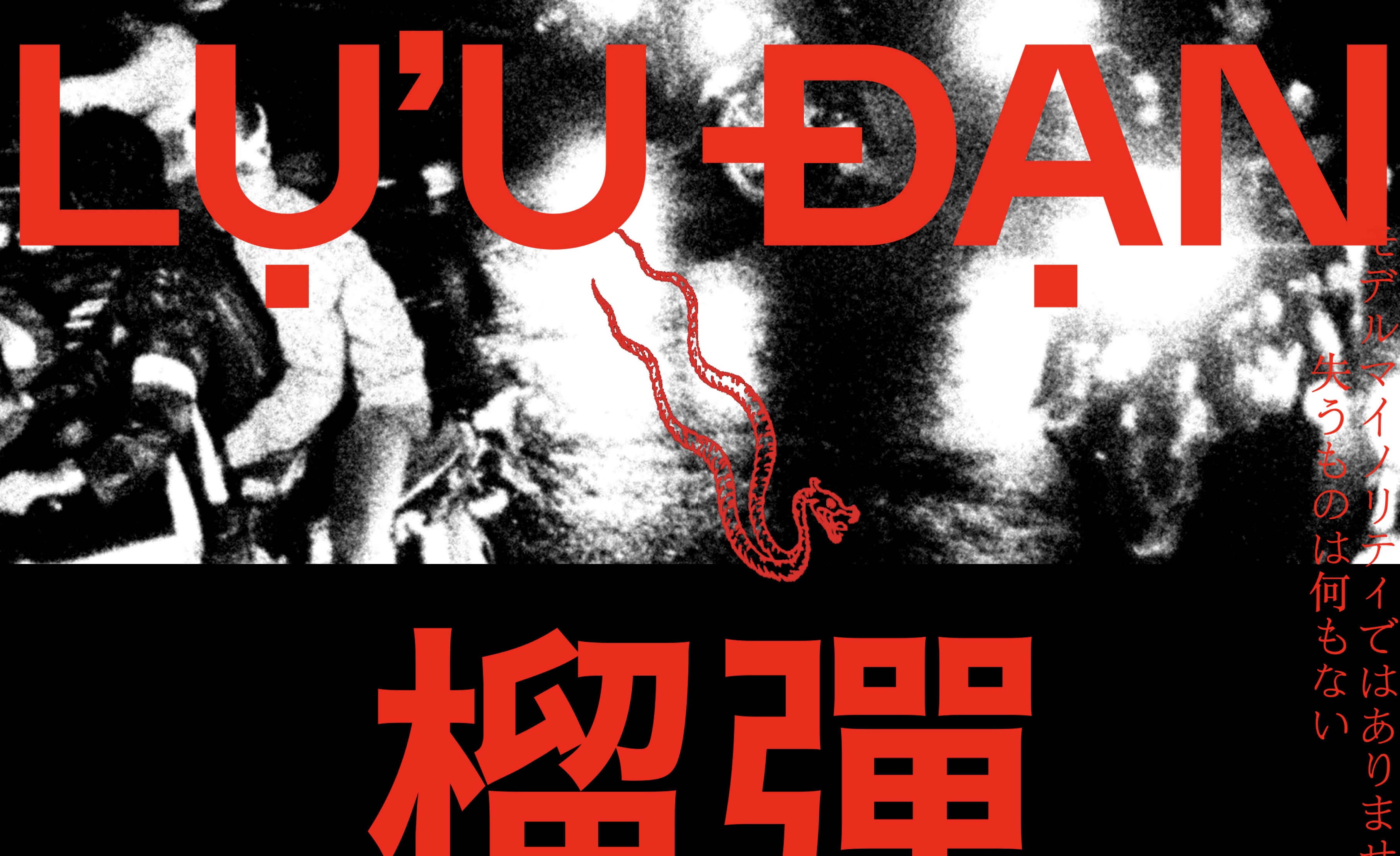
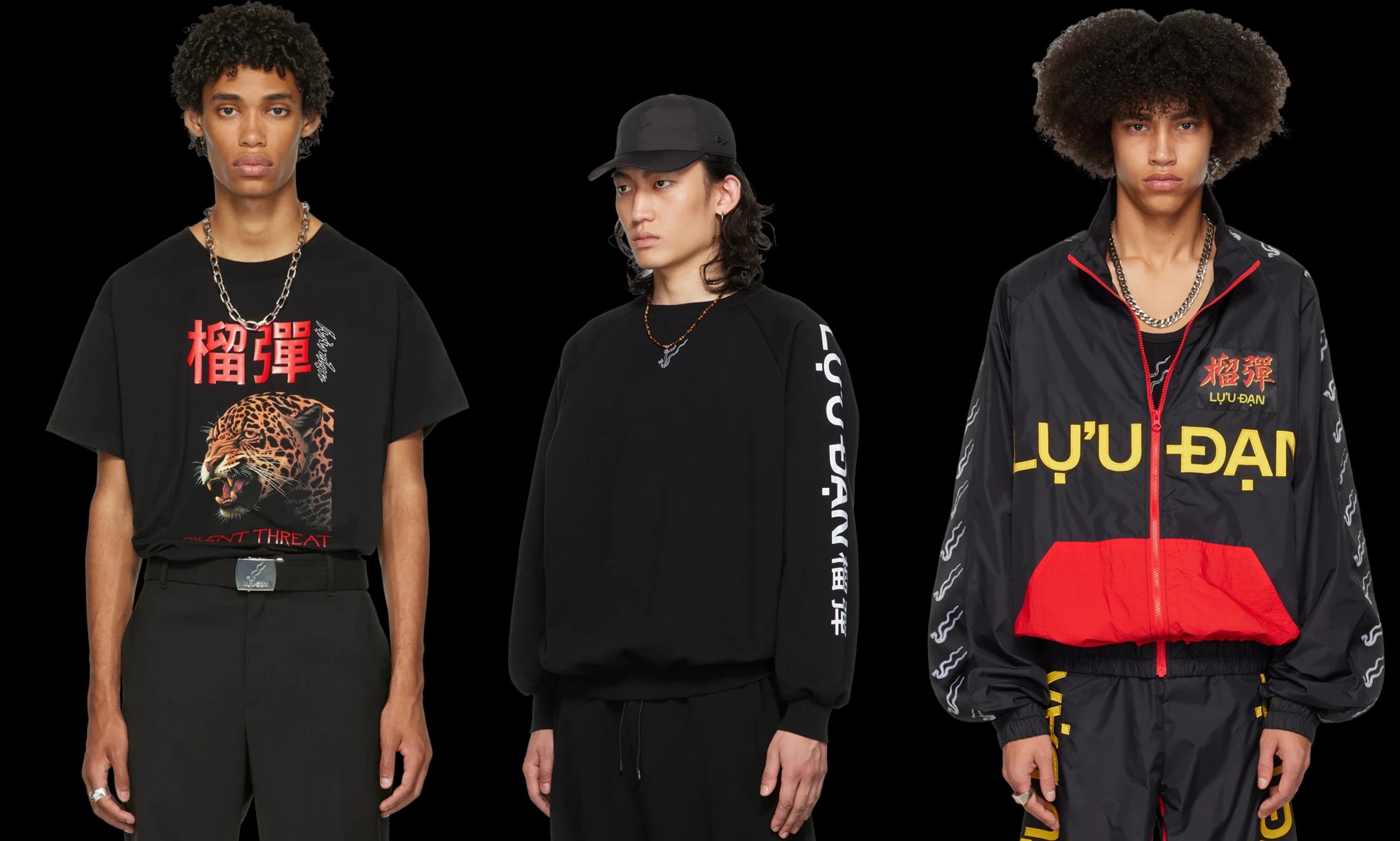
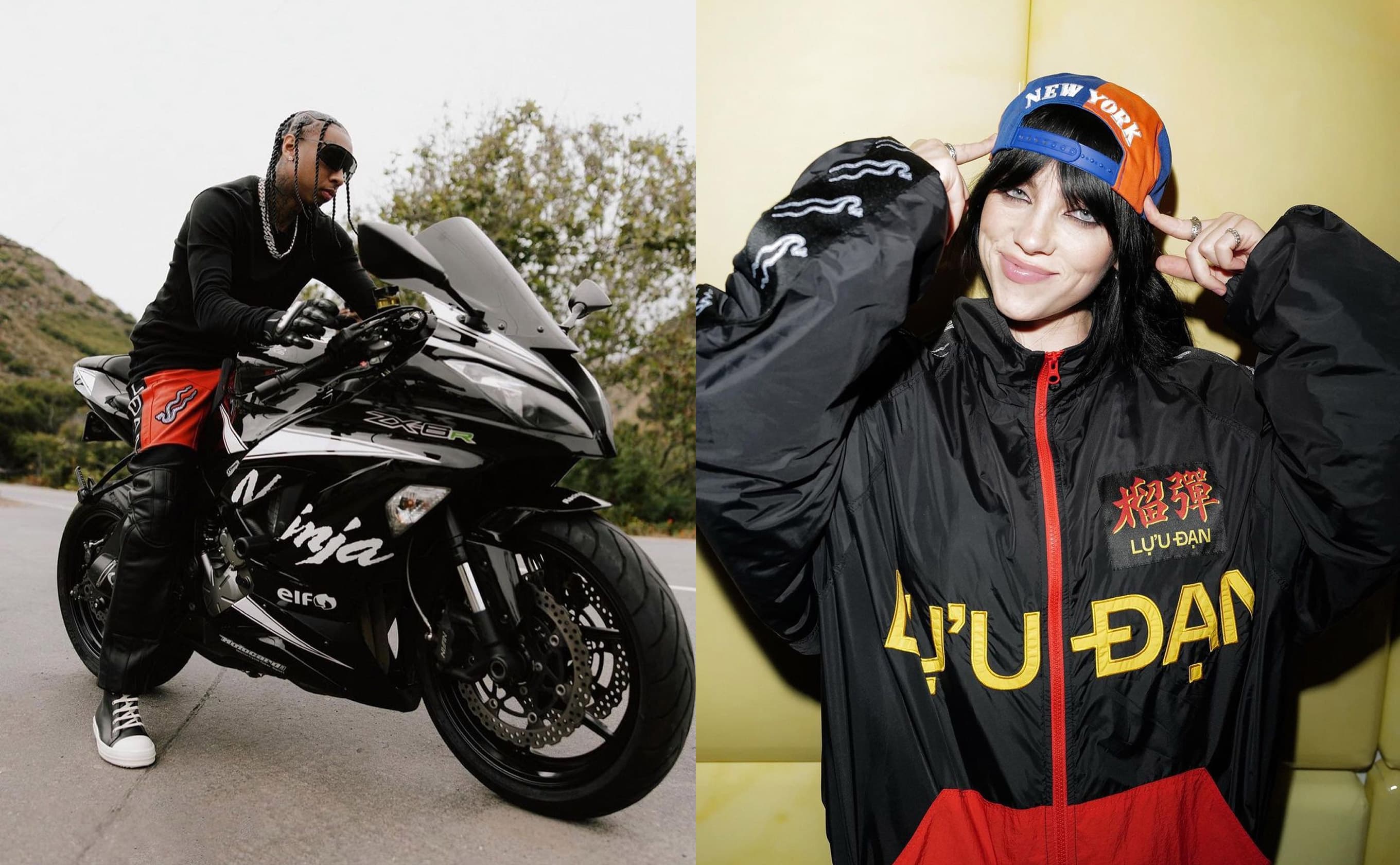
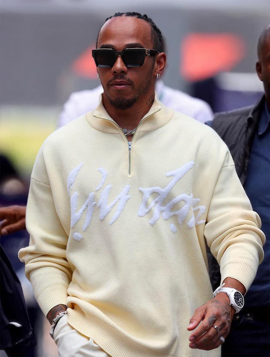
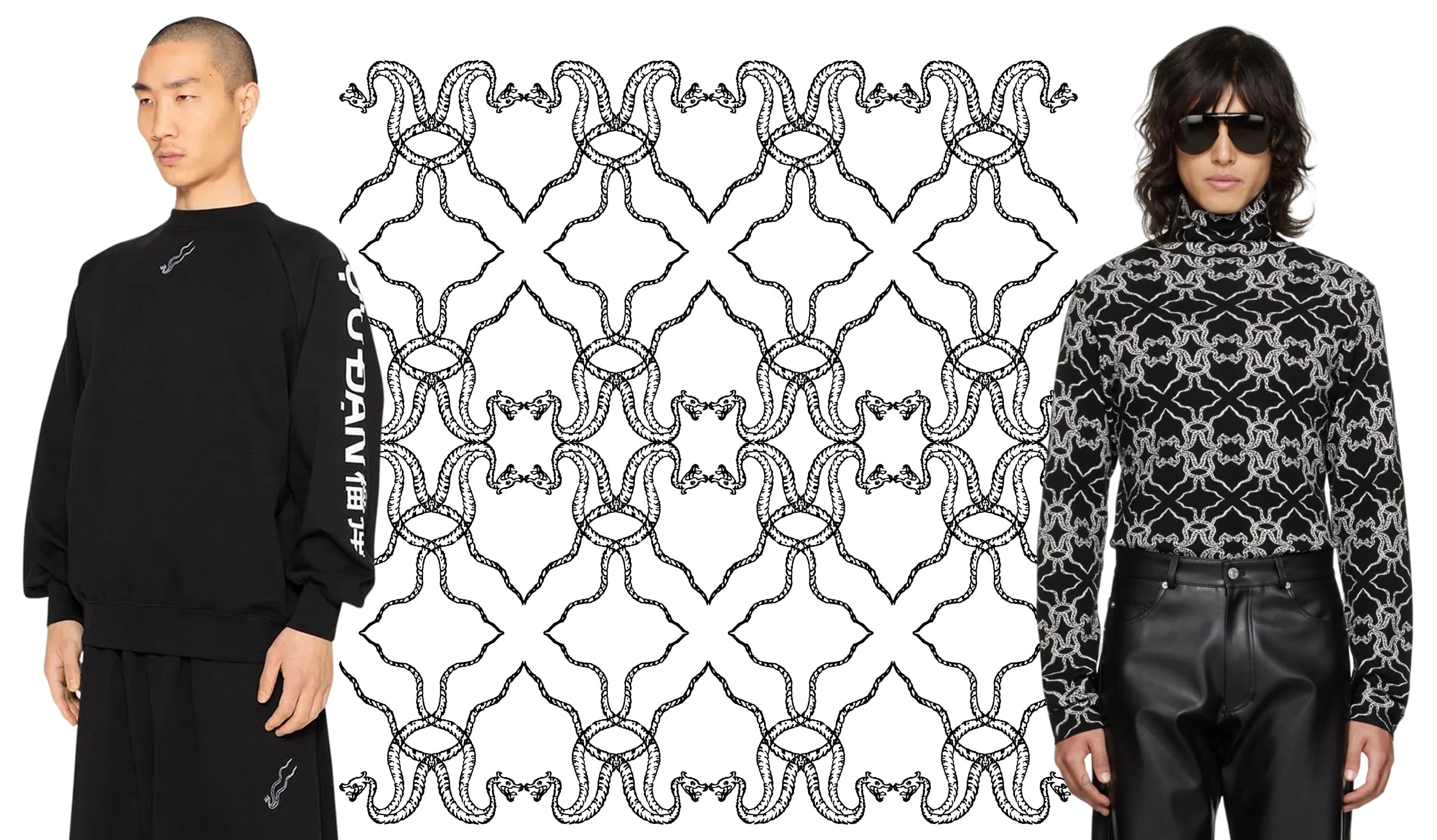
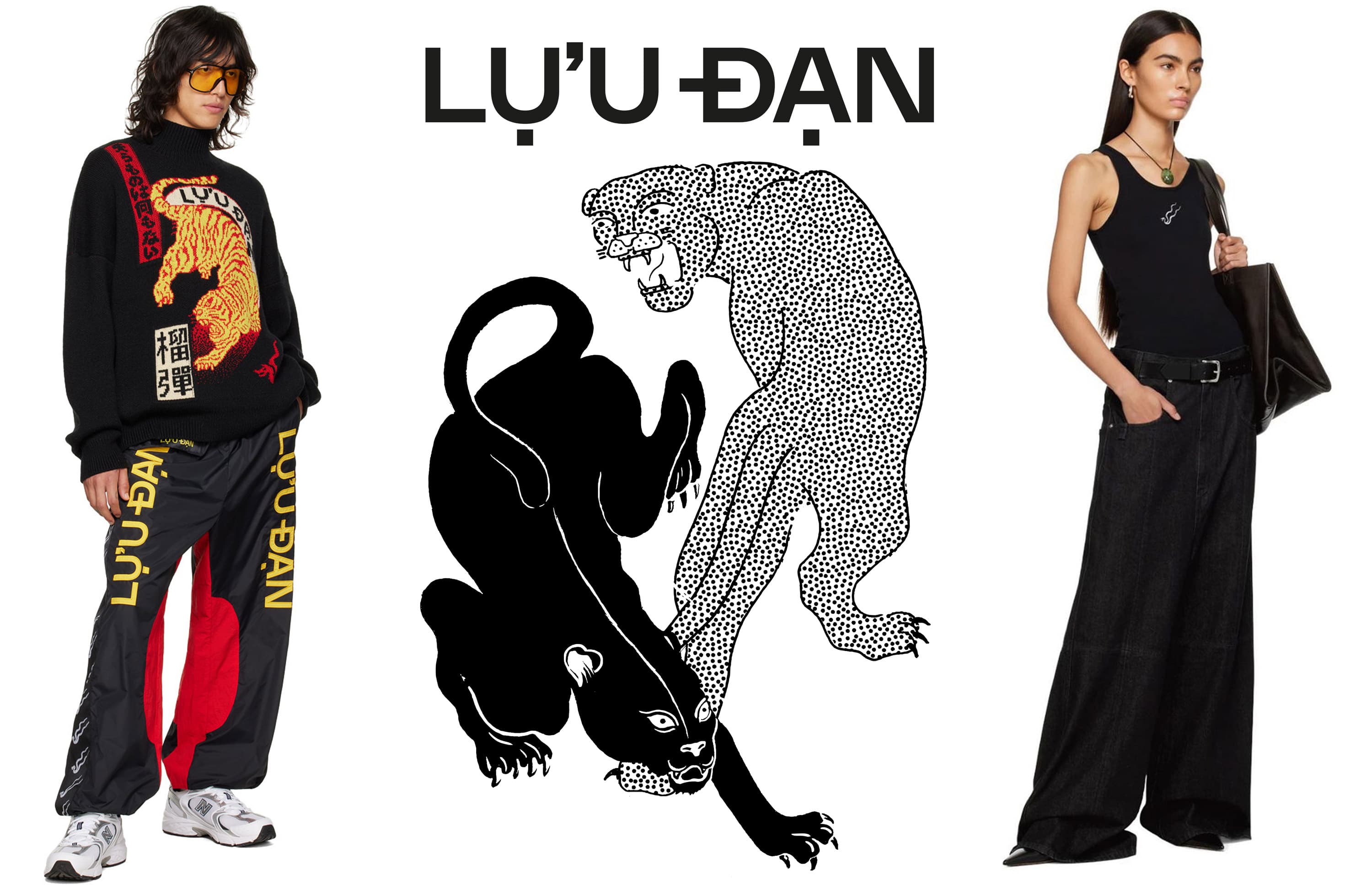
Instead of a heraldic crest, LỰU ĐẠN carries spirit animals. I drew and developed the graphic system of double-bodied snakes, prowling jaguars and tigers that replace swords as the brand’s code of arms. These graphics live across garments, packaging, and campaign material, giving the label an iconography that is instantly recognizable and deeply rooted in its story.
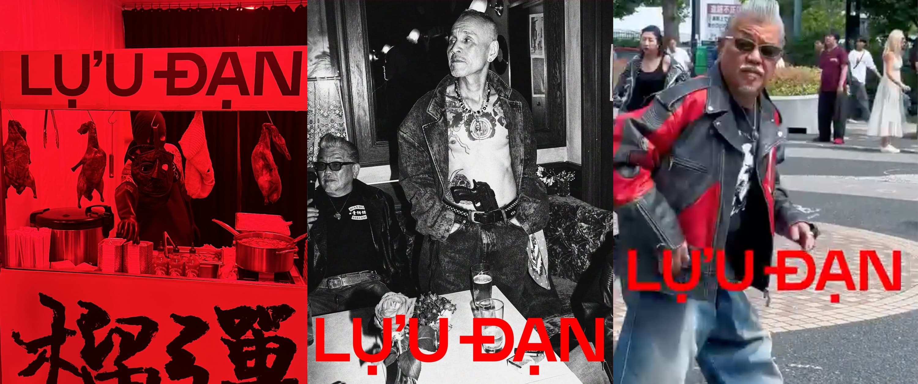
The collaboration continued past the debut: stockist and sales decks to bring the label into new shops, a sponsorship deck, and seasonal graphic work. Hung La later contributed a personal essay to PRESENT Issue 3, extending the relationship from client work into publishing.